slintcn isn't a dependency. The CLI copies Slint source into your
repo, rewrites the imports to fit your layout, and stays out of your way.
You own the files
slintcn add copies .slint source into your project. Edit it however you want. Imports rewrite to match your folders.
A real CLI
init, add, list, view, build. Install from the built-in registry, a URL, or your own namespace.
Theming
Dark by default, light at runtime. Pick a base color (neutral, zinc, slate, stone) when you init.
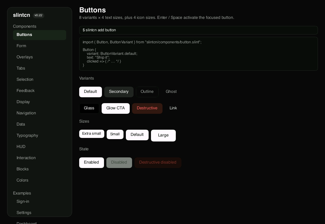
56 components
Buttons, dialogs, tables, tooltips, and more. Typed variants, focus rings, keyboard nav, and animations are built in.
8 blocks
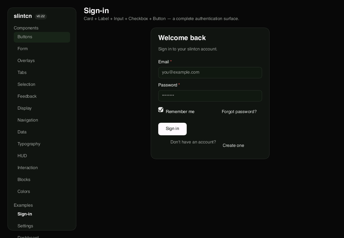
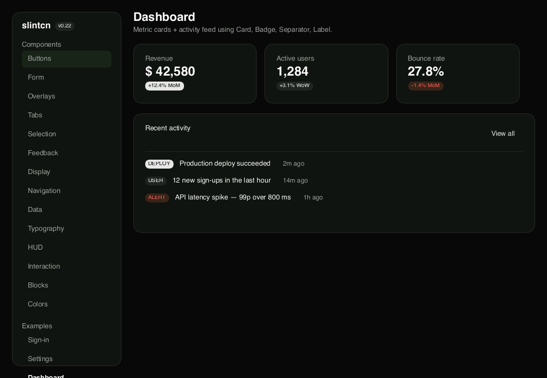
Sign-in, login, pricing, dashboard, settings, team, profile, and stats. Whole screens you install like any component.
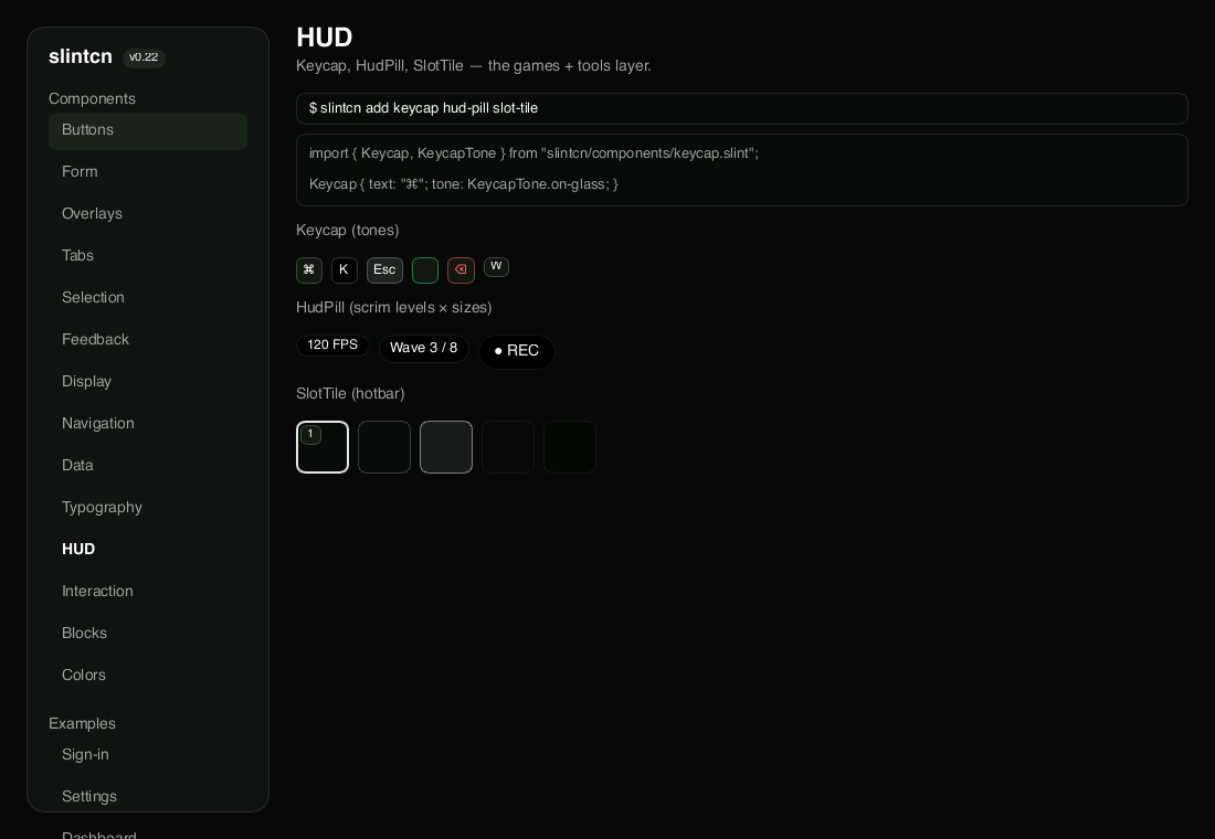
Made for tools and games
A HUD layer most kits skip: Keycap, HudPill, and SlotTile for keyboard hints, status pills, and inventory slots.